– Limpide, who are you in a few words?
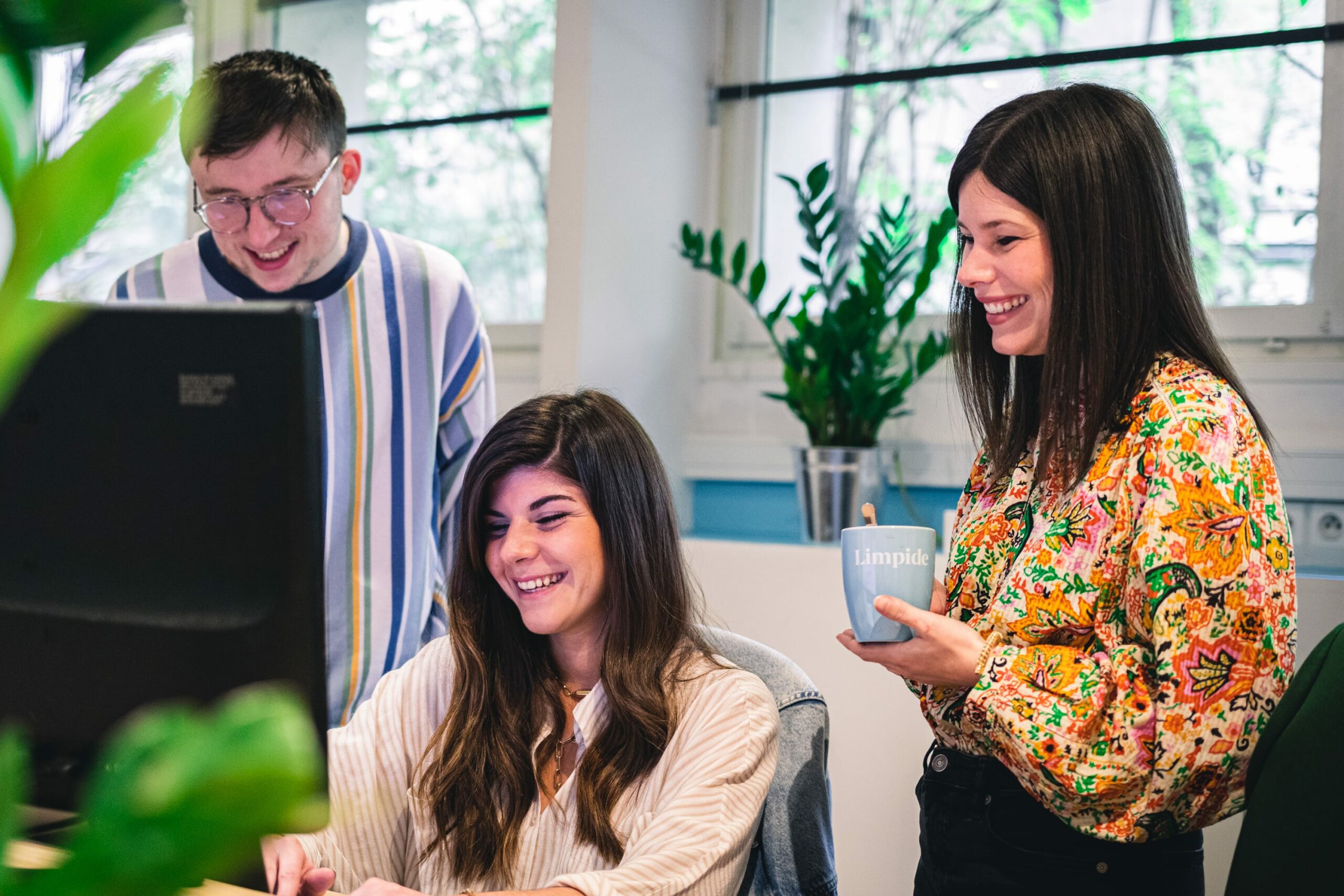
Limpide is a digital agency that places the user experience (UX) at the centre of all creative processes, with an approach focused on the pursuit of performance. We analyse digital ecosystems, design brand and digital strategies, and create websites and applications that are in line with our customers’ objectives. We are not specialised in a particular sector of activity: our immersive method allows us to draw out the stakes of a project and our team of enthusiasts designs systems to respond to them effectively.
– You have been accompanying Arte for the past year. What is your view of the progress made?
Limpide: Our first experience with Arte Charpentier was a great encounter around a wonderful project, that of giving new life to the agency’s digital ecosystem through a modern and inspiring new website. From the outset, we felt a real enthusiasm for the project and full support for the methodology to be implemented. We conducted interviews and organised a series of workshops, which enabled us to bring all the teams together and to open up new strategic and creative perspectives. We are proud of the result, happy to help spread the digital culture a little more within the agency, and delighted to have shared a beautiful human adventure with the whole team at Arte Charpentier.
“We met Arte Charpentier for a first consulting mission: the starter-kit. This first subject enabled us to help them to define and orientate their web strategy. A great professional and human collaboration that prompted the Arte Charpentier and Limpide teams to continue with a second project: the redesign of the site.”
Cyril, Business developer
– In your opinion, what makes a good website?
Limpide: A good website must first and foremost meet one or more clearly defined objectives. This can be to do with image, visibility, acquisitions, or sales. The site should take these objectives into account to guide the user circuits, the browsing experience and the content. The definition of a good site will therefore be very different between an eCommerce site, oriented towards performance and sales, and a site like that of Arte Charpentier, with a very strong image objective.
“With Alix and Laura (Limpide), we identified the productions that most interest users, and we have thought about how best to highlight them on the new site!”
Benjamin, Traffic manager
– This was your first experience working for an architecture agency. Did you approach the design of the site differently? Were there any new challenges for you?
Limpide: We were particularly motivated to be working with such beautiful material, but we didn’t really make any adjustments to the method itself, because it can be adapted to any type of project. Of course, we took great pleasure in immersing ourselves in the architectural sector through our research, meetings and benchmarks. In the end, the important thing was to understand the uniqueness of Arte and its various professions in order to align perspectives internally and transmit the right message, the right experience. As an agency, we also found common ground between our own issues and those of Arte, which facilitated our work.
– 3 rules for effective digital communication?
Limpide: – Define your objectives and means: you have to set a goal to reach and size it according to your resources.
– Broadcast the right content on the right channel: each channel/social network has its specificity, and the messages/formats that you broadcast must differ according to these specificities.
– Analyse and adjust: you don’t necessarily find the miracle recipe on the first attempt, you always have to try to understand what worked or not, to optimise future campaigns.
“Arte Charpentier is one of those brands that already has a very rich DNA, but we had to manage to sublimate that by means of a real brand experience.”
Manon, Brand manager
– Philosophical question: has the health crisis made you call your fundamental vision of the internet into question?
Limpide: The health crisis definitely considerably accelerated the digitalisation of companies and contributed to the awareness that it is necessary to manage one’s presence on the internet, to invest in digital services and web acquisition channels. In a sense, this stimulates creativity, opens up new opportunities, and it’s fascinating to see how fast we can adapt.
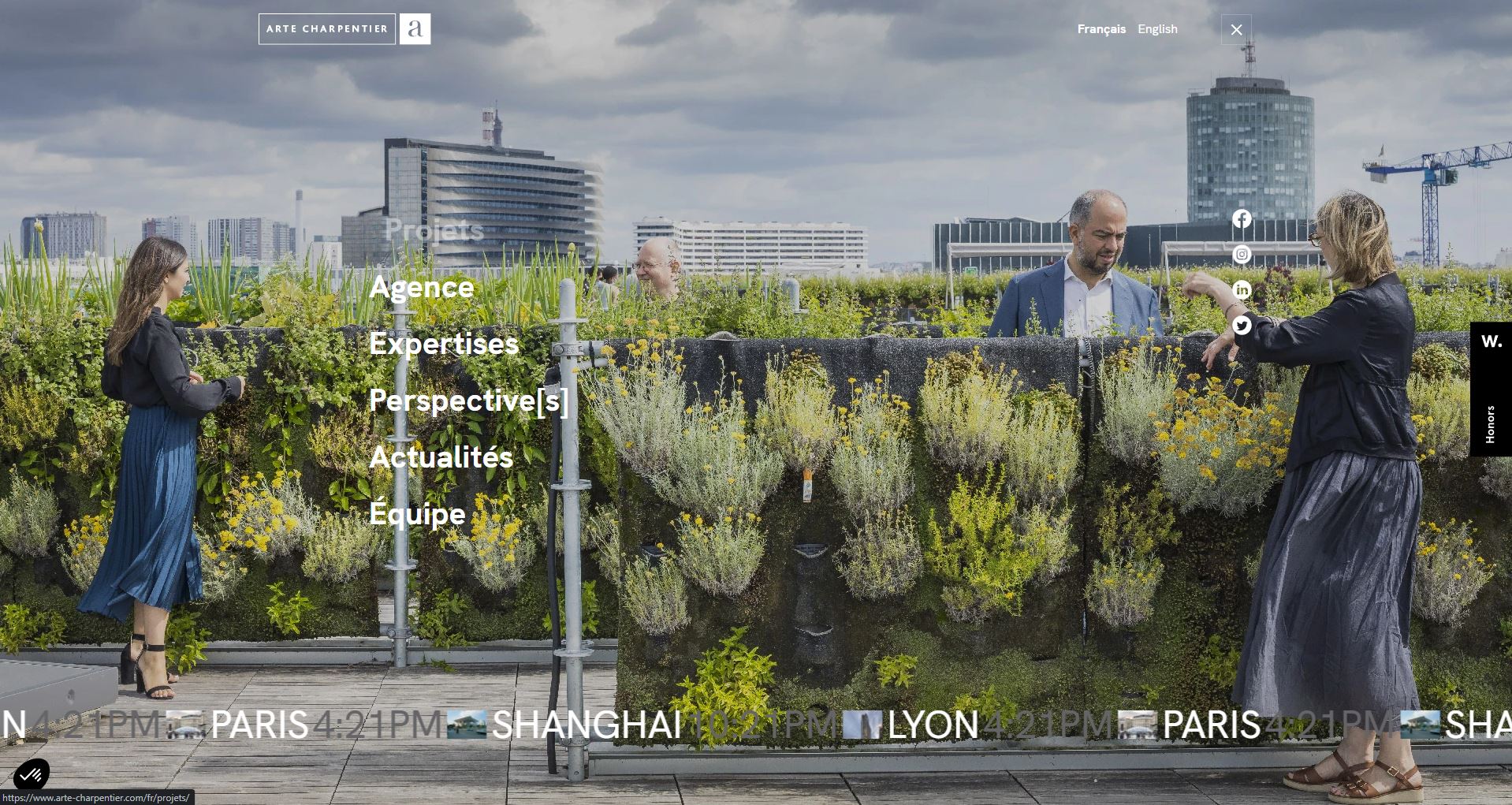
“It was a real pleasure to design this new website with the project team. We worked with a twofold ambition, first of all to highlight the diversity of projects through a fluid user experience, but also to give the floor to Arte Charpentier’s experts with the creation of the Perspective[s] blog.”
Laura, UX Consultant
– Which detail or idea for the Arte website are you most proud of?
Limpide: This is a very good question, because we paid a lot of attention to detail in our UX and UI. It’s difficult to choose, but I would say the rollovers on the thumbnails of the home page, the double presentation of the project sheets, with the simplified version and the more complete version, and finally the search system in the list of projects.
